FORAGING FRIDAY: PLATES & PRESENTATION
 Foraging Friday documents Kitchen Toro's exploration of New York's diverse restaurants, neighborhoods, stores and their ingredients and flavors.
To graduate from the French Culinary Institute you need to keep a consistent grade average, move up through levels one through four, pass a midterm, hand in a final project and then pass a final.
I've taken a look at some final projects done by FCI graduates. Some are better presented than others and some ideas have more cache. There were menus like: Aphrodisiacs, Carribbean Fruit, Greek Food, Squid, Movies, and Indian & French Fusion among others. There was also great variety of presentation: spiral notebooks, bound books, bound crafted books, laminated pages, and plastic sleeves. All projects had pictures, some were accompanied by hand-drawn illustrations.
All this is to say that there's some thought that needs to go into the final project to come up with something that you're proud of attaching your name to. I've started to come up with some dishes (to supplement the desserts I've been thinking of!) and the next thing I needed to get were the right kind of plates on which to present the food. I'm not saying you have to get special dishes for the menu but that's my idea of doing things the right way. This Foraging Friday is a search for plates and presentation.
The search breaks down in two stages:
PLATES I need plates in a style that will suit my menu. As I was still piecing together the menu, the idea of the plates started to force me into making decisions about dishes and my theme. I'm tentatively going with an "Everything Old is New Again," meets "Standard Dishes from Classic Cuisines, Reinterpreted." It's "Frozen Caprese," and "Thai Iced Tea Ice Cream with Coconut Sticky Rice" meets "Crispy Butter Chicken," and "Citrus Cured Salmon." I'm also tempted to add a dessert tasting menu. As my menu is eclectic, the plates should be simple but stylish so that they're not distracting-- the menu itself will be thought-provoking, not crazy angles on the dishes.
COLOR I need colored placemats or cloth on which to place the dishes or I need to decide that the surface is going to be white.
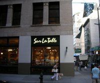 My search started near my school, at Sur La Table. The selection was somewhat limited but I found some pieces of cloth that might make a good base on top of which the plates could be presented. I made a mental note to consider the colors while I looked for my plates.
 Next door I stopped into the MoMA Design Store, Soho (81 Spring Street) to see if there was anything in there that might inspire me. Unfortunatley, inspiration was not the first thing I found. The plates I found at their online store look much better than what I found in the actual store and one of them even looks similar to what I ended up deciding on elsewhere.
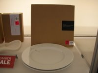 Instead I discovered the most terrible idea for a plate I've ever seen. And maybe that's exactly why they appear to be included in a summer sale. Look away or skip on down to the Silver Spoon cookbook if you're squeamish.
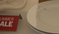 Above, to the left is a plate with a black squiggle design along the rim (close-up at the right). Tell me that it doesn't look like a pubic hair on a plate. No chef could have possibly designed this plate. Why on earth would anyone create such a disgusting plate? I forgot to find out who the designer was so there's unfortunately no public flogging by name but I may return just to find out.
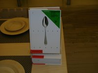 Moving on, the Phaidon, Silver Spoon Cookbook was on display. It's an Italian cookbook translated for the first time into English. I want one but can't justify spending the money on it right now as I have no income since leaving The Times.
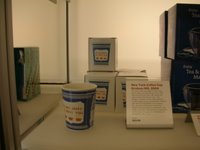 I did come across the "Have A Nice Day," coffee cup tranlated from paper classic to porcelain. I'd love to do something with an after-dinner coffee drink or a dessert of some kind but I decided to think on it before making the purchase.
 Overall, the store was a bust. But at least I knew what I didn't want. Next stop, Crate & Barrel. The employees quickly became tired of me taking pictures (the idea was to click, compare and send them via cellphone to someone for a second opinion) and told me that they'd be willing to take a Polaroid for me but that becuase of design fraud they didn't allow pictures. Just for the record, this is ridiculous. If I was going to steal the designs of these plates I'd buy a set and take them to China with me I wouldn't stand there taking pictures. You'd think that they'd be used to this kind of behaviour with all the New York couples registered there. For all you Crate & Barrell people out there, "BOO! BOO to YOU!" Stop picking on a poor student.
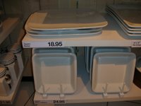 Despite their behaviour, I did like what I was seeing. Immediately, when I saw this baking tray I pictured a cobbler being added to the dessert menu, a Southern dish to round out the menu filled with different cuisines. Later back at Sur La Table I found a matching ramekin with woven-basket covering which cemented the cobbler as part of the desserts.
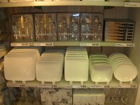 But now I needed something to match that style. The flat square plates offered a nice contrast to the angular square flat plates that I'd liked for their surface area but disliked because they smacked too much of Asian-fusion.
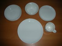 An hour later I'd settled on a style that was flat and low to the table allowing the food to be well-displayed while also giving me ample surface area on which to either place healthy portions or to provide some negative space around the food with which to better show it off (hopefully the food will be attractive on it's own!).
 The plates had a slight lip to match the cobbler dish and they didn't seem typecast to me as a certain culture. To me they were comfortable yet stylish and could be Spanish, Indian, Southern, Italian or Scandinavian. I was starting to see dishes from these cultures coming together into one several-course meal.
Total Spent at Crate&Barrel: $53.43
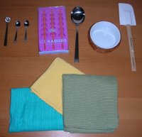 The colors need to be bright and warm but not electric and distracting. I bought three different colors to play with (at right, bottom). I'm partial to using the color at right as the base but may try switching them all up throughout the menu depending on the course. I'll have to experiment. I couldn't pass up the ice kabobs (I know Alton, I'm sorry, but I love toys) and I needed a new spatula because my standard-issue one disappeared at school-- someone "borrowed" it.
Total spent at Sur La Table: $49.03
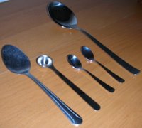 Finally, a tribute to the spoon. In memory of my trail at the three-star restaurant last week, and the difficulty I had using their large spoons to portion brunoise into rings that were about the same width I bought the three small spoons to the right (at left, a conventional spoon to give an idea of the size). The second spoon to the left has a few slots at the bottom, I'm guessing that this is to allow for liquid to drain out (at least that's what I'll use them for). Next to it at the right are two tiny spoons which would have been helpful to me the other night at the restaurant (I don't understand why they were set up the way they were). At far right, a new large tasting spoon, because we've been told at school that every chef needs a "sexy tasting spoon."
Now to put some food on all these plates.


0 Comments:
Post a Comment
<< Home